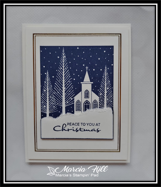
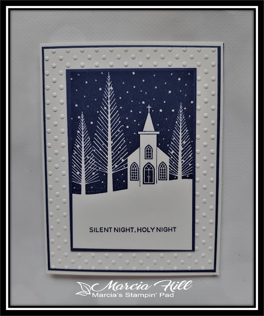
This was a perfect color combination for a new stamp set I had gotten from SU! called PEACE TO YOU. I actually have 3 very simple cards for you today, because I had all the supplies out and now, I think I'm finished with this year's Christmas cards...YAY!! Do I have them all addressed and ready to mail out?? Nope...haven't even started! But that's for another day. Let's look at what I came up with using this color combination...
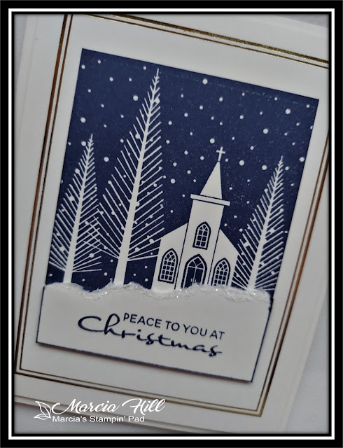
I love this image!! It's graphic but still so pretty!! I used SU!'s Starry Sky ink on Gina K's Ivory cardstock and stamped my sentiment on a small piece of torn Ivory cardstock with a bit of glitter for some sparkle.
I also added Spellbinders Essential Duo Lines Glimmer Rectangles foil plates to add the border in gold foil. CAS and I love how it turned out!
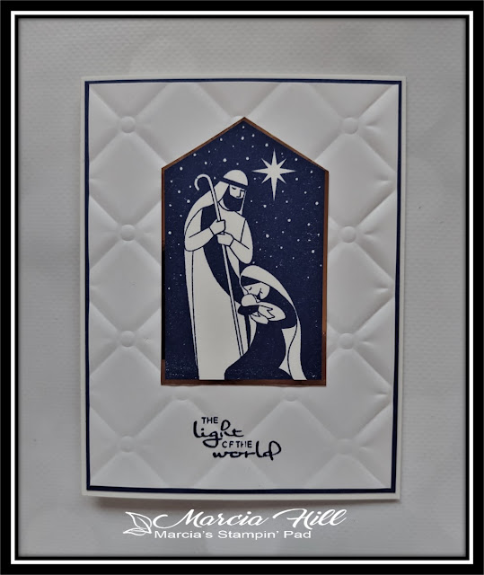
My last card uses the 2nd image included in the stamp set, and I matted it in some gold mirror cardstock and then added it to a background embossed with Spellbinders Tufted ef (thanks Michele!!). My sentiment didn't stamp too well over the raised background, but hopefully whoever receives this one won't mind!
Make sure you check out all the FABULOUS cards from the DT and their special GD for inspiration, and then play along...you've got the whole month to play. Check it all out right HERE.

Thanks for stopping by today ... I love it when you do!


Beautiful!
ReplyDeleteMarcia, a funny thing happened on my way to the Color Hues gallery - I found the WWCD! Oh, my friend, this is so very lovely! Isn't this the most wonderful color combo for your new stamp? [I immediately thought of our church from the Ferguson Paper Village]
ReplyDeleteJoseph and Mary are so very beautiful, too - they look quite cozy on their tufted panel. I don't see one thing wrong with that sentiment, Marcia - it's perfect!
=]
Be still my heart! Marcia, these are so elegant and classic and lovely and you rocked the challenge!! What wonderful designs, and the simplicity is beautiful. I love that gold foiling too!
ReplyDeleteBeautiful cards Marcia. ANd navy is such a perfect color for the stamps. I have this one in my collection too.
ReplyDeleteMarcia, these are just fabulous! I just love that first image and both of your interpretations of it are great. I do love the gold framing of the first one. The image of Mary and Joseph is also wonderful. Looks like you have a head start on next year's Christmas cards! Thanks for sharing with us at Color Hues!
ReplyDeleteThree beautiful cards with this set (and I love it too). I love how you changed the background in each card. Thanks for sharing.
ReplyDeleteThese are both peaceful and beautiful! Love them both, Marcia!
ReplyDeleteThree beautiful cards that are perfect with this colour combo. Always fun to get new things to play with. :) Congrats on getting all your Christmas cards made! xx
ReplyDeleteThese are gorgeous, Marcia! I love the CAS color palette of navy and cream. The touches of sparkle and gold on the first card are perfect.
ReplyDeleteAwesome stamping, Marcia! These are such pretty images and your inking is so crisp. That's a challenge for me. Love the peaceful feeling of all these designs!
ReplyDeleteElegant simplicity. Very crisp stamping. Love these graphic images. I'm in awe!
ReplyDeleteThis post is full of fabulous cards, Marcia! I love each and every one! That tufted EF is something I need to add to my Christmas list. Thanks for making the colors shine at Color Hues.
ReplyDeleteSuch a beautiful trio of cards Marcia - so dofferent and such lovely layouts. Ina GD December.
ReplyDeleteWow - love the crispness of these wonderful images Marcia! a beautiful trio of cards! perfect in the blue/white colors! xx
ReplyDeleteEchoing the others: your trio of cards is gorgeous! You may consider them 'simple', but I think they're simply stunning! And yes, they do convey a sense of peace...and joy! So delighted that you played along with us at Colour Hues.
ReplyDelete~carol